What is the difference between CMYK and RGB?
CMYK is the colour format that most commercial printers use to create their printed material and the format that we use to print your transfers. CMYK is made up of four ink colours, these are cyan, magenta, yellow and black. These colours are added to white paper until the desired colour is created.
Our printers, however, use CMYK inks (Cyan, Magenta, Yellow, and Black). Ink works differently from light and can’t reproduce the same bright RGB colours. So when we print your design, any colours that are too bright for CMYK will be automatically adjusted to the closest printable match. This can make them look a bit duller or slightly different than what you saw on your screen.
RGB (red, green, blue) is the colour format used for screens (like phones, tablets, and computers) – these are made from light, which allows them to display super bright and vibrant colours, including neons and electric tones.
Why Your Bright Colours May Look Duller When Printed — and How to Avoid It
We often get asked why artwork that looks super bright on screen can appear less vibrant when printed using our transfers. Here’s a quick explanation:
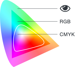
Colour Gamut
A gamut is the complete range or scope of something. In digital and print design, a colour gamut is the range of colours you can achieve using different colour combinations like CMYK and RGB.
An RGB colour gamut is much larger than a CMYK colour gamut, meaning you can achieve many more colours in RGB than you can in CMYK. This is why your design may look awesome on screen, but when printed it becomes muddied and dark. Some colours can not be reproduced using CMYK so when you convert the image from RGB to CMYK, some colours will lose their vibrance.
Common Colours That Don’t Convert Well to Print:
- Neon or fluorescent pinks, greens, and oranges
- Bright turquoise or electric blue
- Very vivid purples
Submitting RGB files — and what happens to the colours
If you submit an RGB artwork file, our system will automatically convert it to CMYK and there may be a colour shift if the colours within the are outside the CMYK colour gamut.
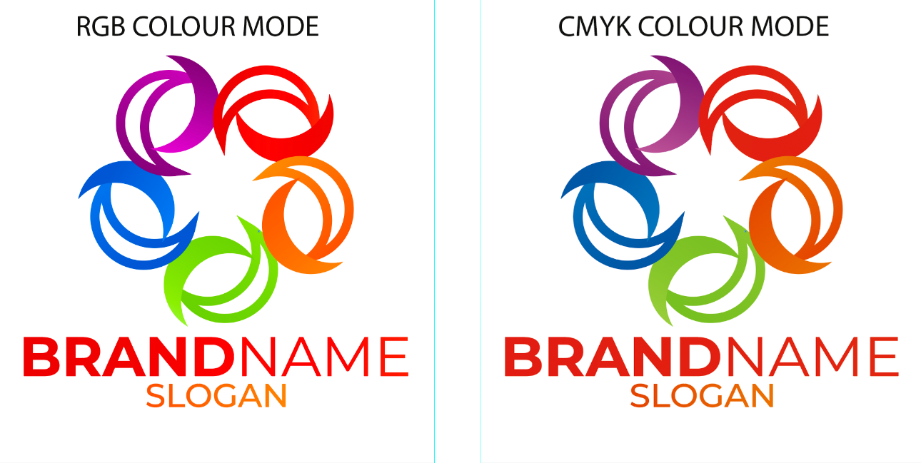
The example below on the left was designed in RGB colour mode, the example on the right is when it was converted to CMYK.
How to Get the Best Results
To avoid surprises, we strongly recommend designing in CMYK colour mode from the start if your artwork is going to be printed. This way, you’re working with the actual colours that can be reproduced in print, and what you see on screen will be much closer to the final result.
If you’re using software like Adobe Illustrator, Photoshop, or similar, just choose CMYK colour mode when creating your document. This gives you a more accurate idea of how your colours will look once printed.
We have put together a guide for colour settings and export settings for the main graphics programs that customers are using to create their artwork.